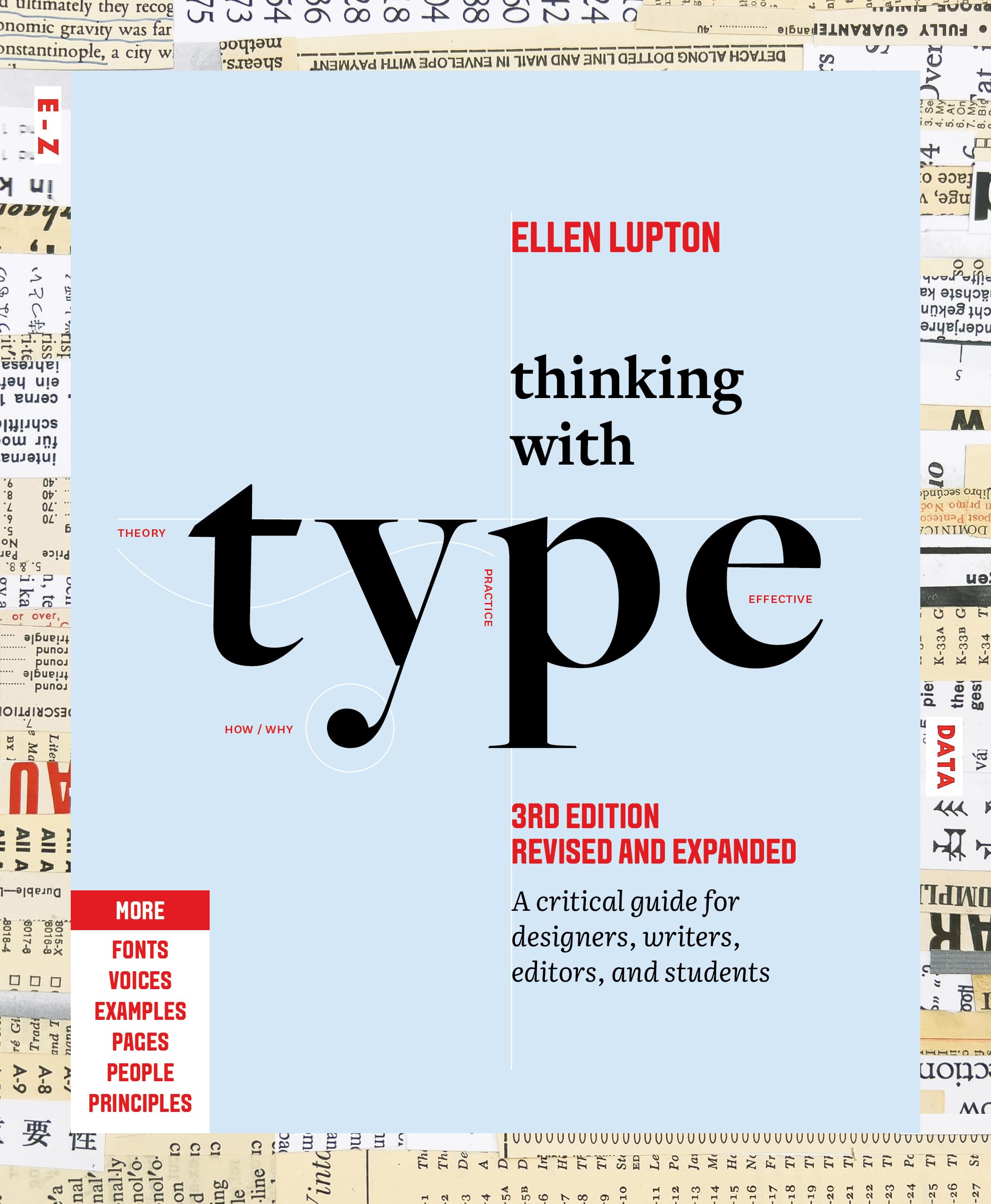
Thinking with Type: A Critical Guide for Designers, Writers, Editors, and Students
Ellen Lupton
Publisher
Princeton Architectural Press
Publication Date
3/12/2024
ISBN
9781797226828
Pages
256
Categories
Questions & Answers
Typography plays a crucial role in shaping meaning and communication across cultures and writing systems by adapting to diverse linguistic and cultural contexts. It serves as a bridge between spoken and written language, allowing for the visual representation of sounds and ideas. Different writing systems, like Latin, Chinese, and Arabic, have unique typographic characteristics that reflect their respective languages and cultural values.
Typography influences meaning through its visual elements, such as letterforms, spacing, and layout. For example, the serifs and sans-serif fonts in Latin typography convey different connotations, while the strokes and structure of Chinese characters embody cultural nuances. In multilingual environments, typography can also facilitate the coexistence of multiple scripts, as seen in the November Type systems for the Indian subcontinent, supporting hundreds of languages.
Moreover, typography can be a tool for promoting inclusivity and diversity. It can be used to represent gender-inclusive language, preserve endangered scripts, and celebrate cultural heritage. By adapting to various cultural contexts, typography enhances communication and fosters understanding across different cultures.
Typography significantly enhances readability and accessibility by shaping how text is perceived and consumed. Key principles include:
-
Legibility: Clear letterforms, appropriate size, and contrast between text and background ensure that characters are easily distinguishable. Factors like x-height, counter size, spacing, and character width play crucial roles.
-
Readability: This involves the ease with which text can be understood. Factors like line length, spacing, and paragraph structure affect readability. Shorter lines and appropriate spacing between lines and paragraphs improve comprehension.
-
Hierarchy and Structure: Organizing text into a logical structure with headings, subheadings, and body text helps users navigate and understand the content. Consistent use of type sizes and styles aids in creating a clear hierarchy.
-
Accessibility: Designing for diverse users, including those with disabilities, is essential. This includes using alt text for images, ensuring color contrast, and providing text alternatives for non-text content.
Effective layout design principles include:
-
Balance: Achieving visual balance through symmetry, asymmetry, or a mix of both creates a harmonious composition.
-
Alignment: Aligning elements can create a sense of order and structure, making the layout more readable.
-
Grids: Using grids helps organize content and maintain consistency across a document or website.
-
Whitespace: Proper use of whitespace can improve readability and create a sense of clarity and openness in the design.
Historically, typography has evolved from humanist scripts like Garamond and Bembo, which were inspired by handwriting and human proportions, to the more precise and structured styles of Bodoni and Didot. The 19th century saw the rise of sans-serif fonts like Helvetica, designed for readability and modernity. Contemporary trends include the use of variable fonts for different sizes and the integration of ornaments and color fonts. Technological advancements have significantly influenced typography, from the invention of the printing press to the digital age. Digital tools allow for greater experimentation and customization, enabling designers to create complex and unique typefaces. The internet has also democratized typography, making it accessible to a wider audience and fostering a culture of experimentation and innovation.
Designers can use typography to convey brand identity and create memorable visual experiences by:
-
Choosing the Right Fonts: Selecting fonts that align with the brand's personality, whether it's modern and sleek or classic and elegant, helps establish brand recognition.
-
Consistency: Using consistent typography across all brand materials ensures a cohesive look and feel, reinforcing brand identity.
-
Hierarchy and Structure: Employing visual and semantic hierarchy in typography helps guide the viewer's attention and emphasize key information, making the message more impactful.
-
Customization: Creating custom typefaces or modifying existing ones can provide a unique visual element that sets a brand apart.
-
Whitespace and Spacing: Proper use of whitespace and spacing around text can enhance readability and create a more balanced and visually appealing layout.
-
Color and Contrast: Using color and contrast effectively can highlight important information and evoke emotions, contributing to a memorable experience.
-
Experimentation: Playing with different type styles, weights, and sizes can create dynamic and engaging visuals that capture attention and leave a lasting impression.
-
Narrative: Typography can be used to tell a story or convey a message, adding depth to the brand's identity and creating a more meaningful connection with the audience.
Typography carries significant ethical considerations and social implications. Ethically, designers must consider the impact of their work on diverse audiences, ensuring that typography does not perpetuate biases or exclude certain groups. Socially, typography can influence perceptions, promote inclusivity, and even shape cultural narratives.
To promote inclusive and accessible design, designers should:
- Diversify Fonts and Characters: Use fonts that represent a wide range of languages and scripts, catering to diverse linguistic communities.
- Inclusive Language: Employ gender-neutral language and punctuation, like the gender star, to avoid excluding non-binary individuals.
- Legibility and Readability: Design for readability by considering character shapes, spacing, and line lengths, ensuring that text is accessible to those with visual impairments.
- Accessibility Features: Implement features like alt text for images, proper use of headings for structure, and responsive design for various devices.
- Cultural Sensitivity: Be aware of cultural nuances and avoid appropriating designs without proper understanding and respect.
- User-Centric Design: Involve diverse users in the design process to ensure that the final product meets the needs of a wide audience.
By considering these aspects, designers can create typography that is not only visually appealing but also ethically responsible and socially impactful.